

 SPARK Website
How Many Pixels Is an Inch? It Depends — and Here's Why That Actually Matters
Learn how to convert inches to pixels correctly for web, print, and screen design. Understand PPI, DPI, and why the same inch gives different pixel values depending on your project.
I remember the first time I sent a design to print and it came back blurry. The file looked perfectly sharp on my screen. Every detail was clean. But on paper it looked like it had been photocopied three times over. I had no idea what went wrong.
Turned out I had built the whole thing at 96 PPI — fine for a website, completely wrong for print. Nobody had ever sat me down and explained that an inch on screen and an inch in print are not the same thing at all. And honestly, once someone finally did explain it, the whole thing made total sense in about five minutes.
So here is that five-minute explanation — the one I wish I had gotten earlier.
The thing about pixels that most people get wrong
An inch is always an inch. Whether you are measuring a napkin or a billboard, that physical distance does not change. Pixels are completely different. A pixel does not have a fixed physical size — it changes depending on the resolution of whatever device or output you are working with.
On an older monitor, the pixels are physically bigger and there are fewer of them packed into each inch. On a modern retina display, the pixels are tiny and extremely dense. Same inch of space, totally different number of pixels filling it.
That is why when someone asks "how many pixels is an inch?" there is no single correct answer. The correct answer is: it depends on your resolution.
The five numbers worth memorising
In real design work, you will run into five resolution values over and over. Once you know what each one is used for, a lot of the confusion about sizing just goes away.
72 PPI gives you 72 pixels per inch. This is the oldest standard, going back to early Mac screens from the 1980s. You still see it referenced occasionally in legacy design workflows, but it is not common for new work.
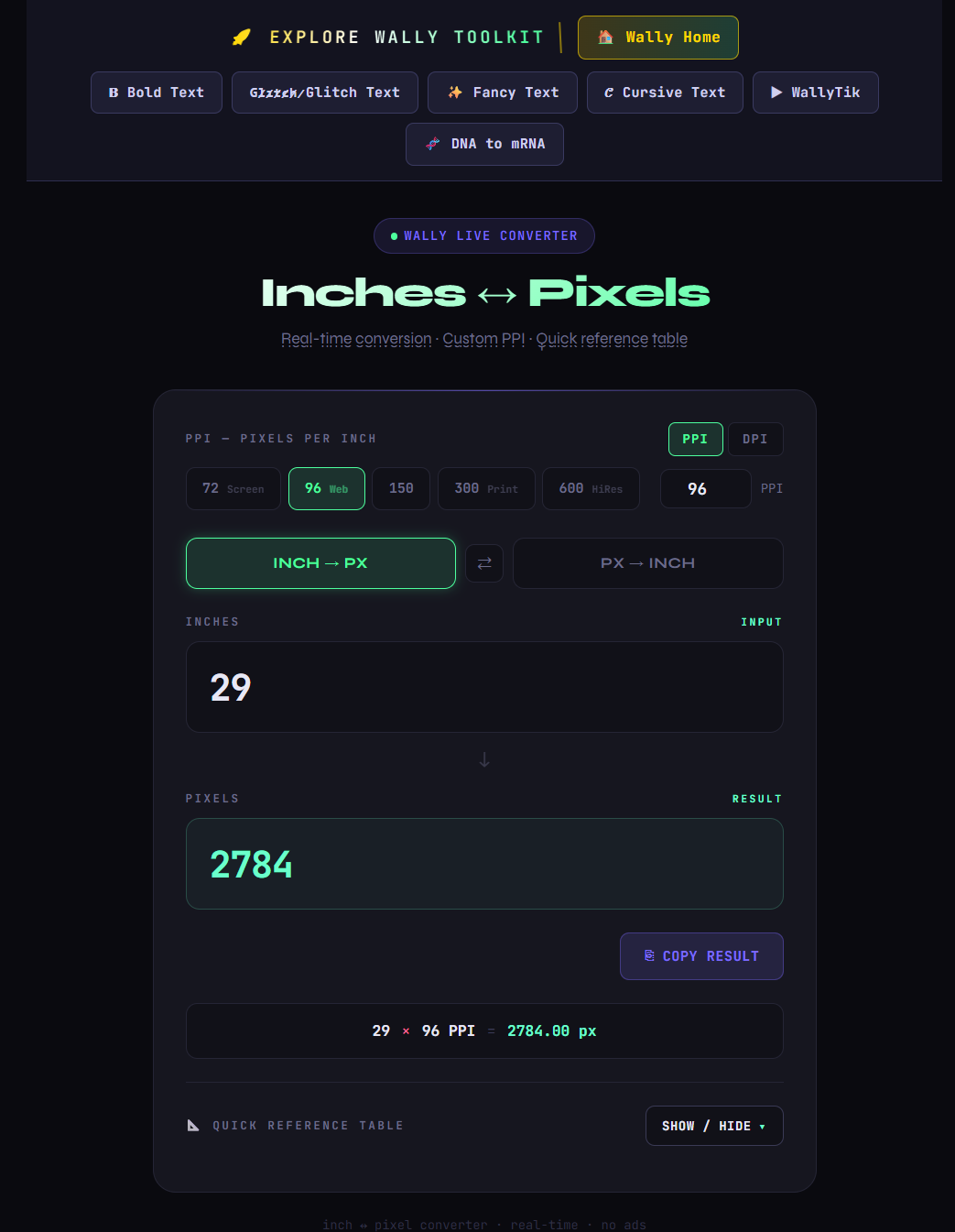
96 PPI gives you 96 pixels per inch. This is the one that governs almost everything on the web. Browsers use 96 PPI as their default. CSS uses it. When you write a value in pixels in your stylesheet, the browser is silently assuming 96 pixels to the inch. If you are building anything for a screen and you are not sure what resolution to use, 96 is your starting point.
150 PPI gives you 150 pixels per inch. This is the middle ground — good for large format printing where the viewer is not standing right next to it. Banners, posters, exhibition boards. When print size is large and viewing distance is a few feet, 150 PPI does the job without creating enormous file sizes.
300 DPI gives you 300 pixels per inch. This is the standard for professional print. Business cards, brochures, book covers, certificates, flyers — anything going to a commercial printer needs to be at 300 DPI. Below this and you will see softness in the output, especially on text and fine lines. Above this and you are usually just making your file larger without any visible benefit.
600 DPI gives you 600 pixels per inch. This is for ultra fine detail work — technical drawings, high-end art prints, anything being printed at very close inspection. Most people will never need it, but it exists and it matters for specific workflows.
What this looks like in actual practice
Here is a concrete example that makes this real. Say you are designing a 5 × 7 inch photo print — a common size for portraits and invitations.
At 300 DPI for professional print, your canvas needs to be 1500 × 2100 pixels. That is the minimum to get a clean, sharp result on a quality printer.
If you accidentally set the same project up at 96 PPI, your canvas would only be 480 × 672 pixels. The print would come out visibly soft and your client would notice immediately.
Same physical dimensions. Completely different pixel requirements. That gap is the entire reason this conversion matters.
Going the other direction
Sometimes the question runs backwards. You have a pixel dimension and you need to figure out how big it actually is in inches.
The calculation is the same formula in reverse — divide the pixel count by your PPI. A 1920-pixel wide image at 96 PPI is 20 inches wide on screen. At 300 DPI, that same 1920-pixel image is only 6.4 inches wide for print purposes. The pixel count has not changed at all. Only the output changes.
This direction comes up constantly when a client hands you a file and asks whether it is large enough to print at a certain size. Plug in the numbers, check the result, and you have your answer in seconds.
A reference table for the sizes that come up most
Rather than working this out manually every time, here are the values you will actually reach for:
| Inches | 96 PPI — Web | 150 PPI — Large Print | 300 DPI — Pro Print |
|---|---|---|---|
| 1 | 96 px | 150 px | 300 px |
| 2 | 192 px | 300 px | 600 px |
| 3 | 288 px | 450 px | 900 px |
| 5 | 480 px | 750 px | 1500 px |
| 8 | 768 px | 1200 px | 2400 px |
| 8.5 | 816 px | 1275 px | 2550 px |
| 10 | 960 px | 1500 px | 3000 px |
| 11 | 1056 px | 1650 px | 3300 px |
Who actually needs this and when
Graphic designers working across print and digital will hit this question constantly. Setting the wrong resolution at the start of a project is one of the most common causes of print quality issues — and it usually only surfaces when the file has already gone to the printer.
Photographers planning to print their work need to verify resolution before ordering. A photo that looks great filling a laptop screen at 72 PPI may not have nearly enough pixels to produce a clean 8 × 10 print at 300 DPI.
Web developers occasionally need to translate pixel values into physical dimensions when briefing clients, planning layouts for physical kiosks or digital signage, or adapting assets between screen and print use.
Students putting together certificates, project presentations, or academic portfolios regularly get tripped up on canvas resolution — especially when they need to export something for both digital submission and physical printing.
Content creators building thumbnails, cover art, or social graphics often work in pixel dimensions but occasionally need to adapt those same files for merchandise, physical banners, or printed promotional materials.
One habit that saves a lot of rework
Before starting any project, take ten seconds to confirm what the output format is and set the resolution accordingly. This single habit — checking PPI or DPI at the beginning rather than the end — eliminates an entire category of problems that otherwise only get noticed when it is too late to fix them cheaply.
For anyone doing this conversion regularly, the free Inches to Pixels Converter at Wally Editing Service handles both directions instantly. Enter your inches and resolution, get your pixel value. Enter pixels and resolution, get your inch value. It shows you the calculation so you understand the result, not just copy it. No account, no download, works on any device.
Once this clicks, a whole category of design headaches just stops happening.
توثيق المستخدمين

 English